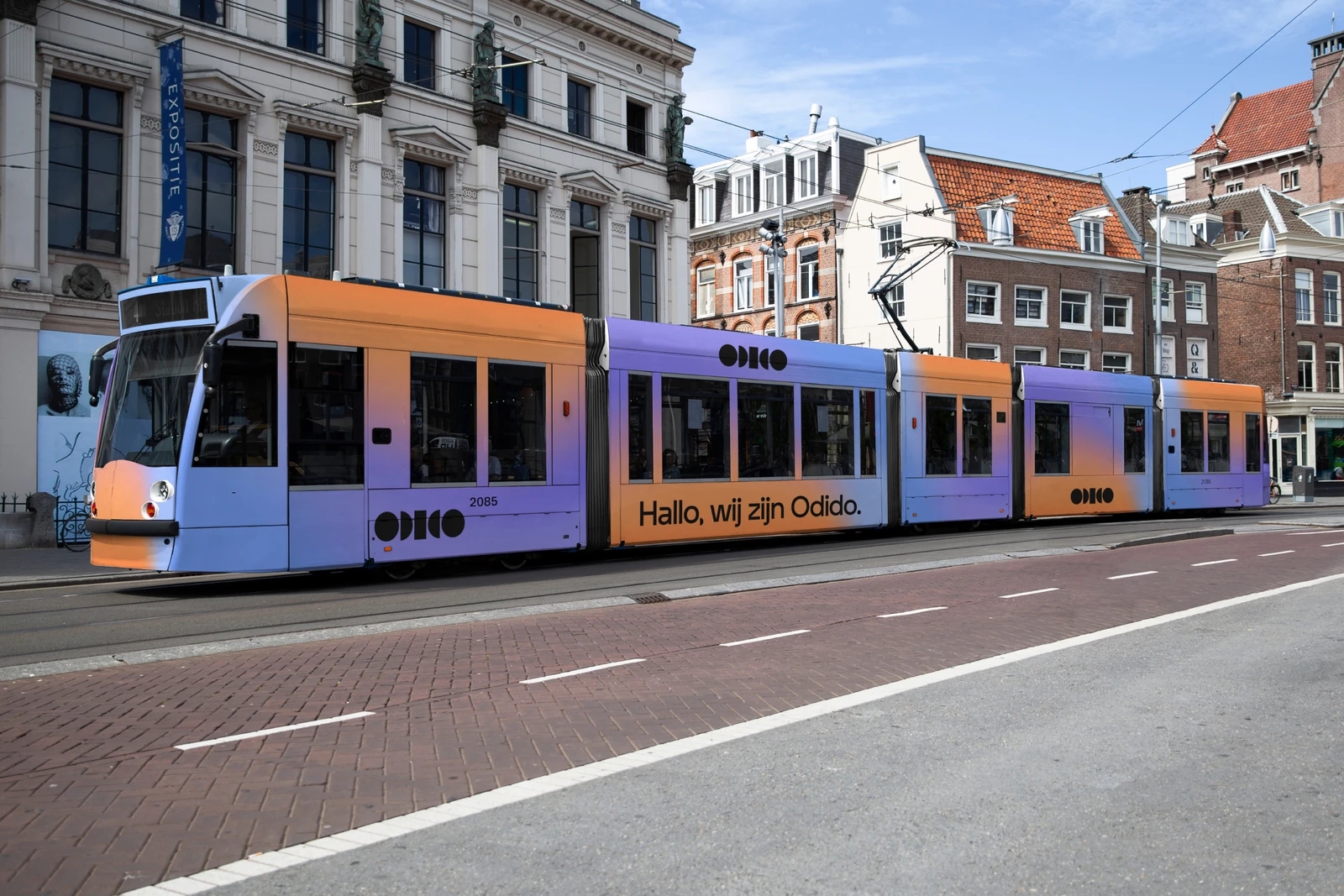
Hello, we are Odido
I am adding some new text in order to see if something breaks
The new provider of mobile, fiber optic and TV.


Our story
From front to back, or back to front, a unique name that stays the same no matter how you read it. A name that consists of different shapes that, together, form a unit. A place where people - no matter their differences - move forward together.
Our brand name
Our name stays the same no matter how you read it. The letters are open, playful and unique characters on their own. But together create a strong unity. This mirrors our optimistic view on the world; as a place of diversity and connectivity.
The joy of taking part
At Odido, we believe we can do better. More human. We fight to keep technology human to ensure we make it enjoyable for all.
We’re a playful, human telco brand.
From our very beginning, we’ve shaken up the market. With a refreshing brand identity based on the principle of “premium for everyone,” we strike a unique balance between maturity, outspokenness, playfulness, and a down-to-earth approach.
Our Identity levels
The visual touchpoints in the brand identity can be divided in three levels:

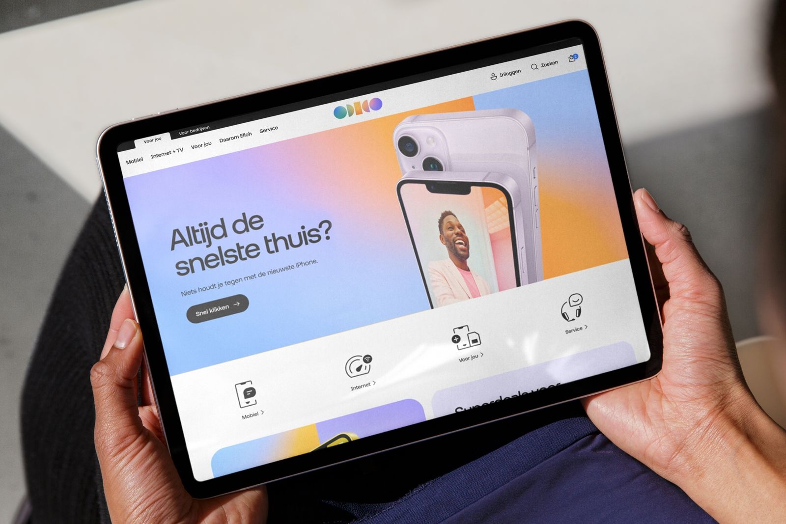
Entry level
Entry level is black, premium and clean with the coloured logo. It’s an invitation to open the door and experience the world of Odido. This is the first layer of a touchpoint.


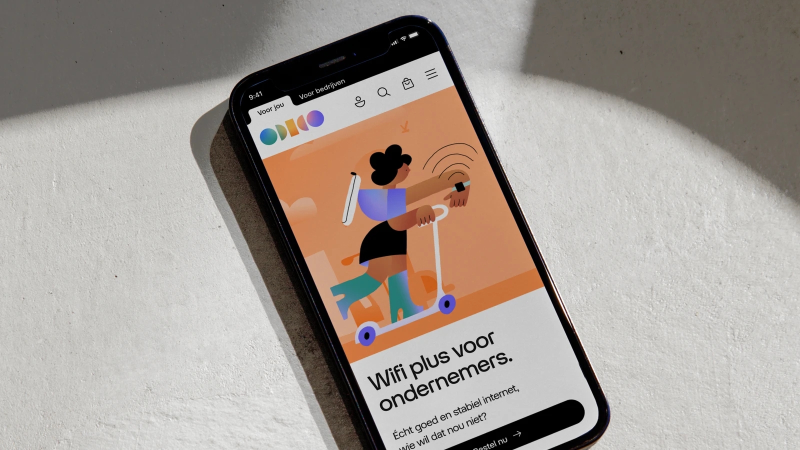
Participation level
Participation level is an immersion into Odido’s lively world. Here the designs are colourful, warm and playful and make you feel part of this world. It’s pure joy.


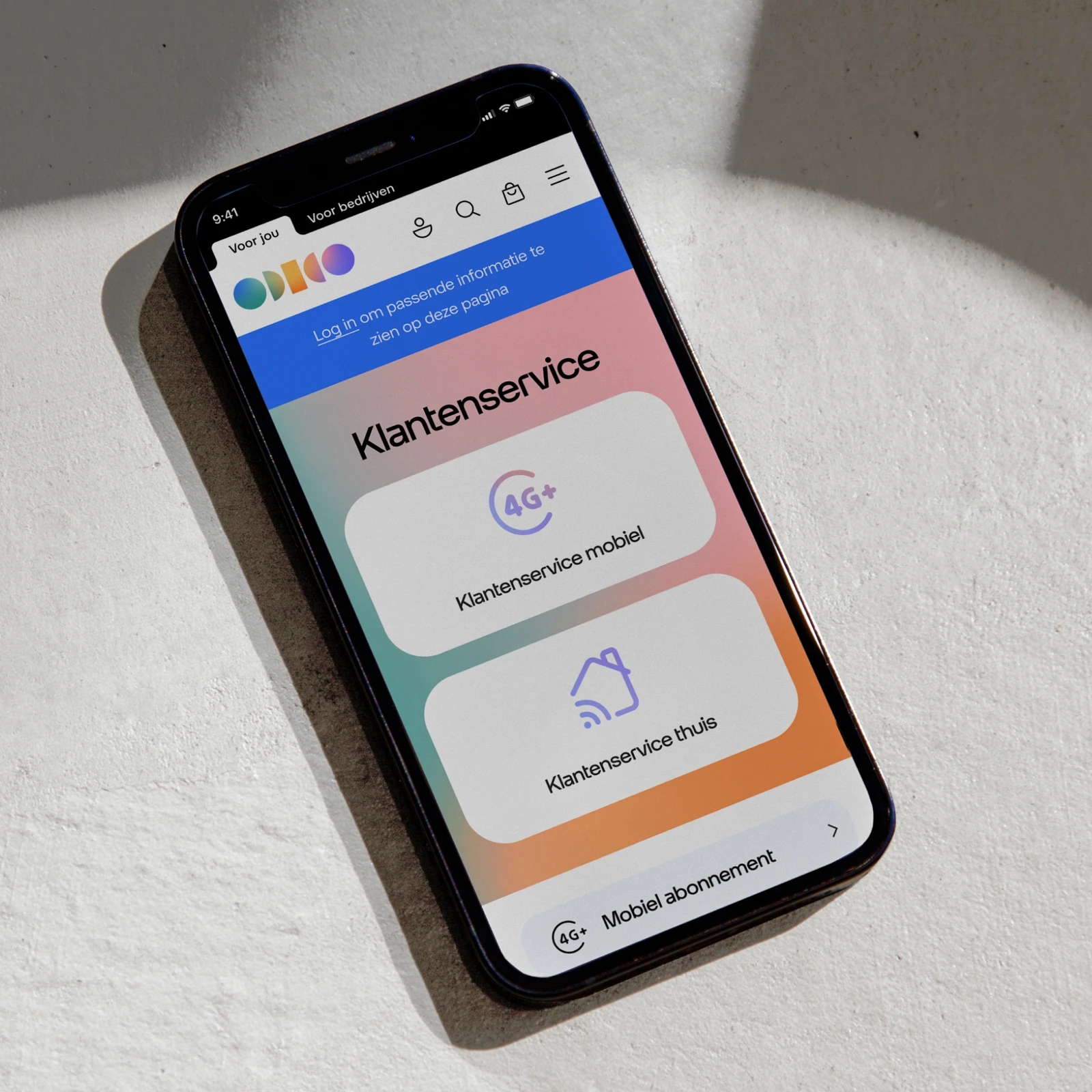
Functional level
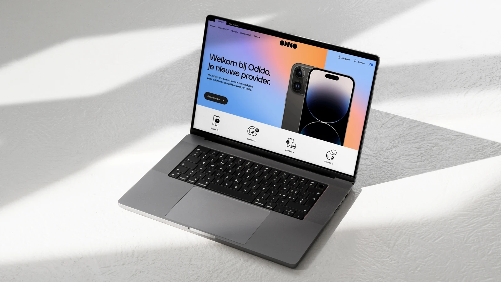
Functional level is mainly white or black with accent colours (dark mode for digital). Used for practical or cost reasons.


Design identity
Our brand assets
Our brand assets bring the Odido visual identity to life.
Logo
Colour
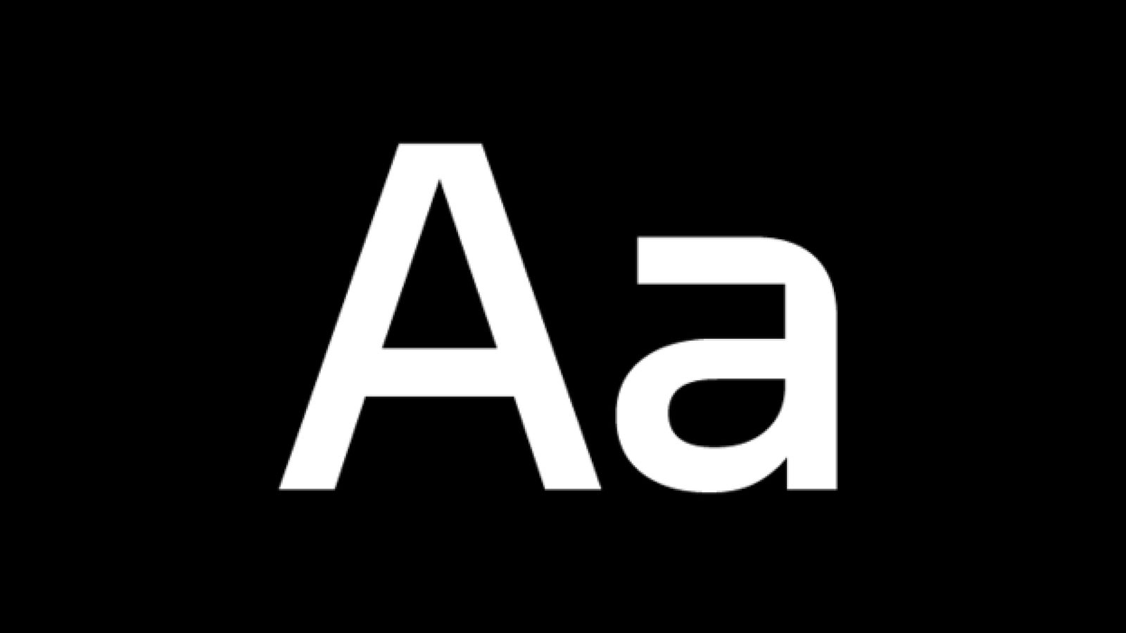
Typography
Photography

Iconography
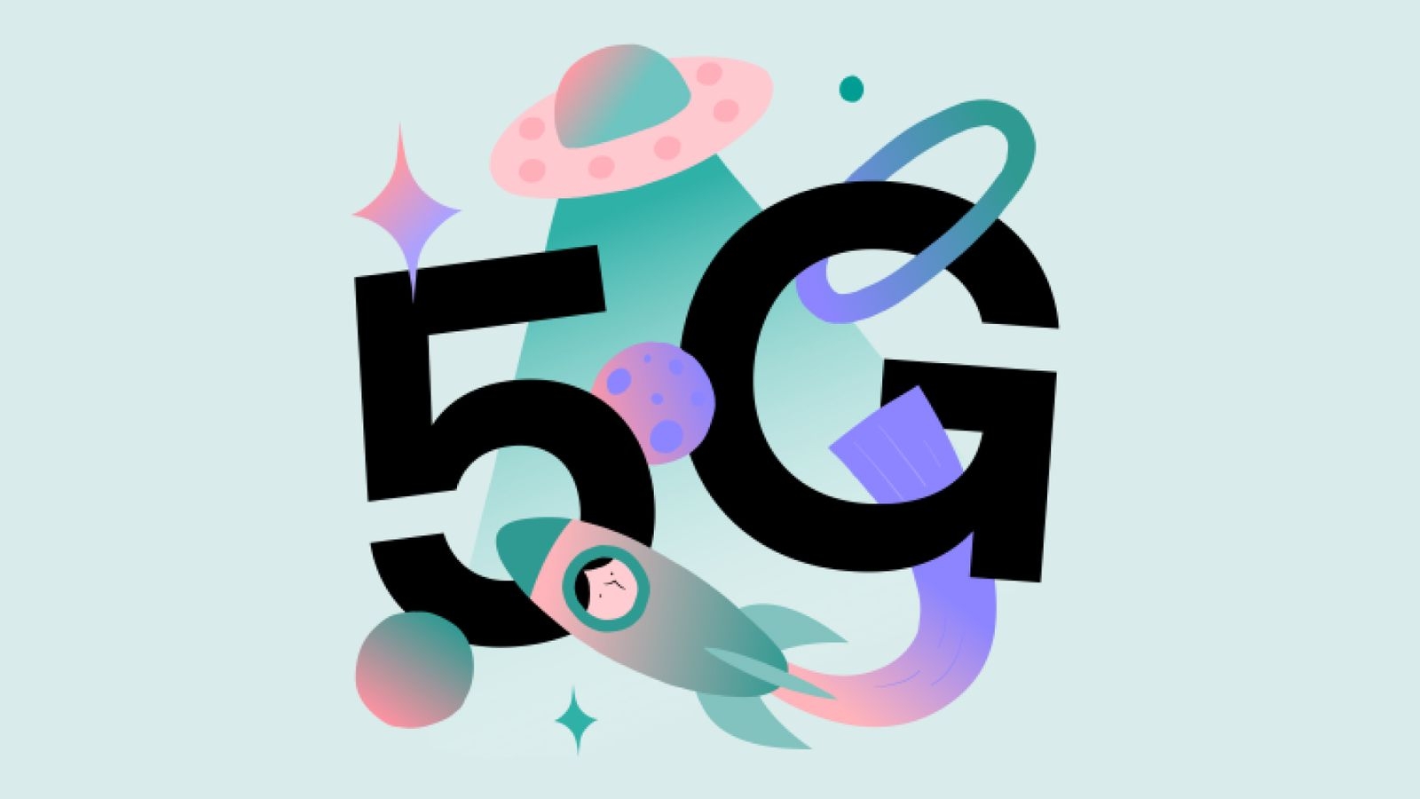
Illustration
Shapes

Sonic

Motion
Application examples
Explore the following examples to see how our design identiy can be effectively utilised.